Music Of the Sphere
Typography | Fall 2023 | Concert Poster | AGD 2250
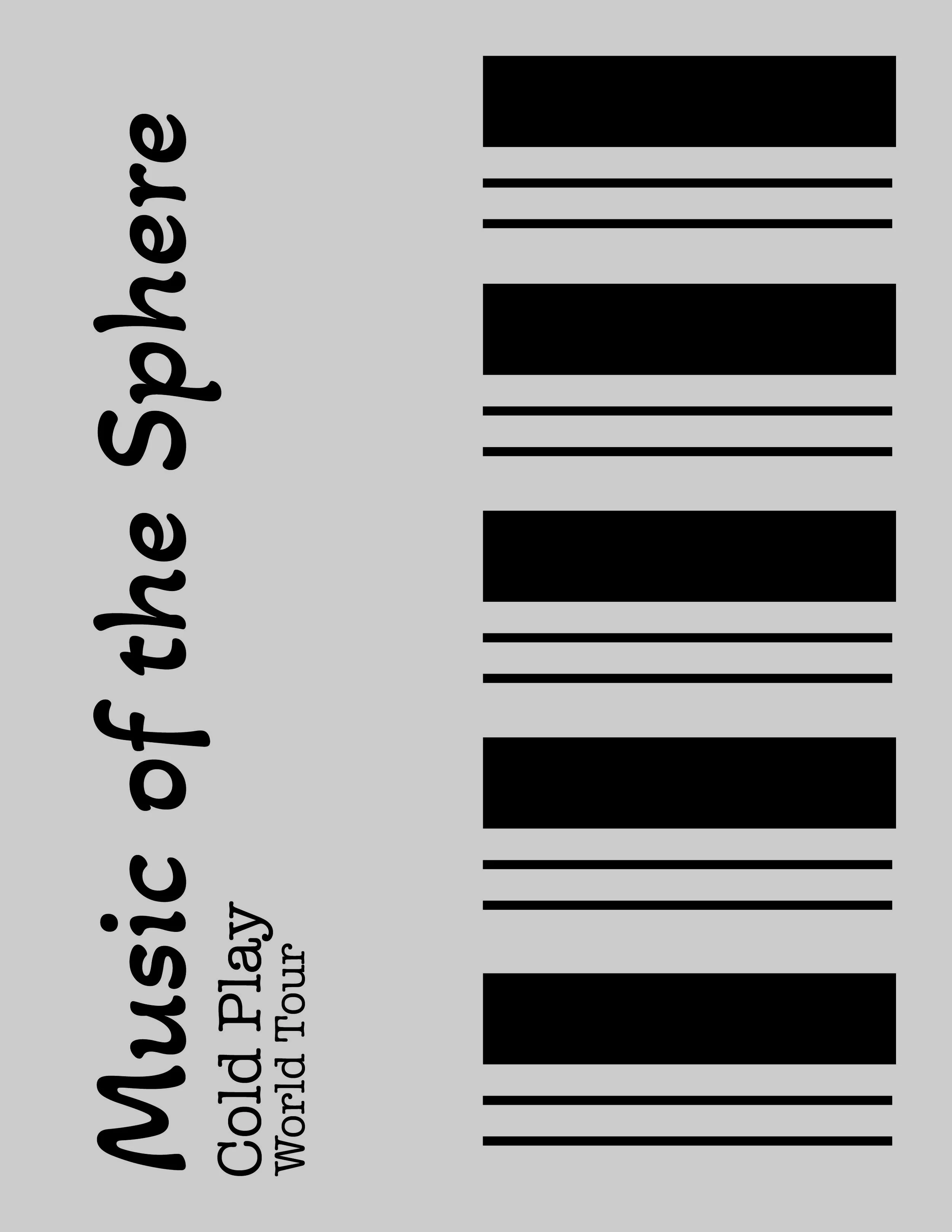
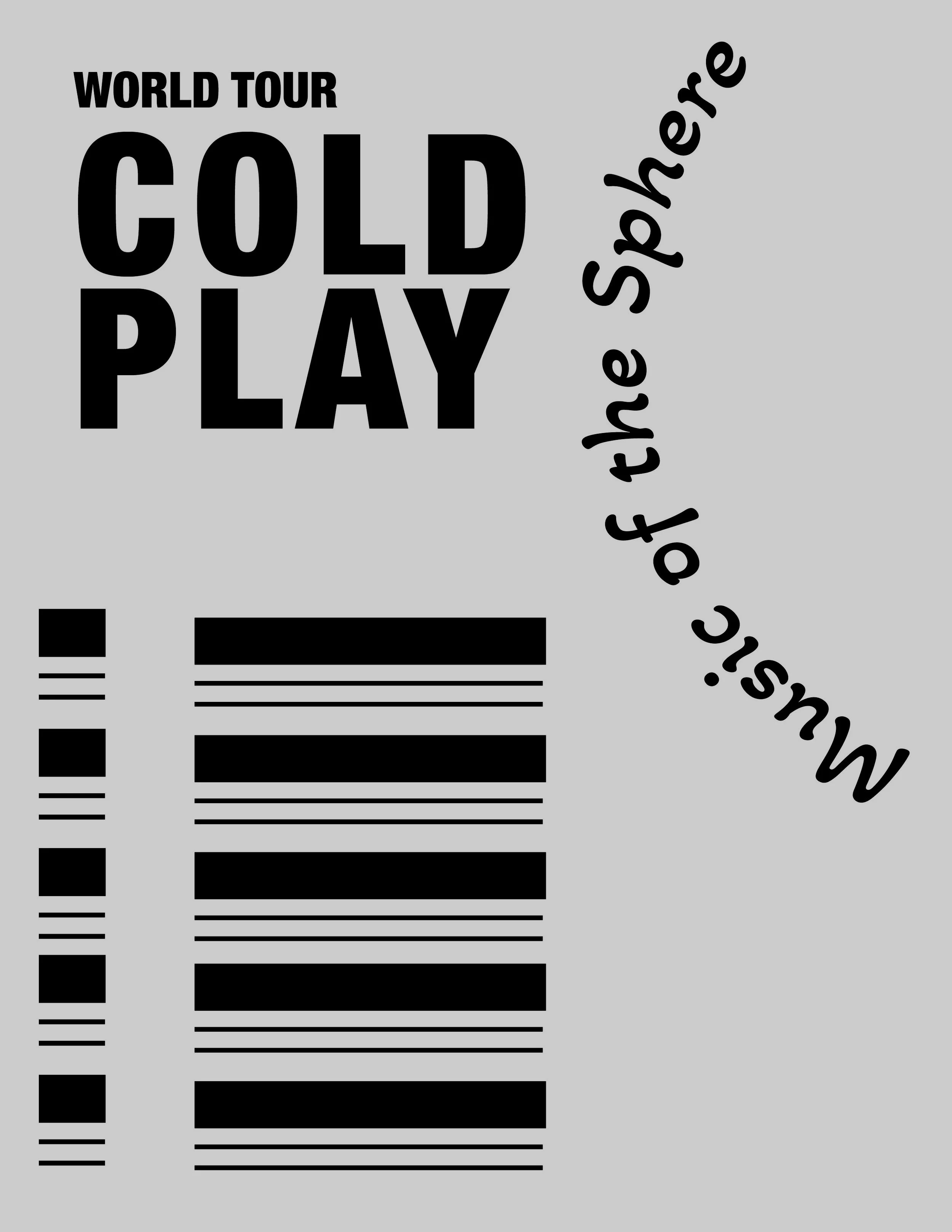
This is another academic project from my typography class. The assignment was to design a poster advertising an event of our choice. The event needed to have a schedule with a date, time, and location, which we then had to reformat into our own design. The project focused on using a modular grid system as the foundation for the composition.
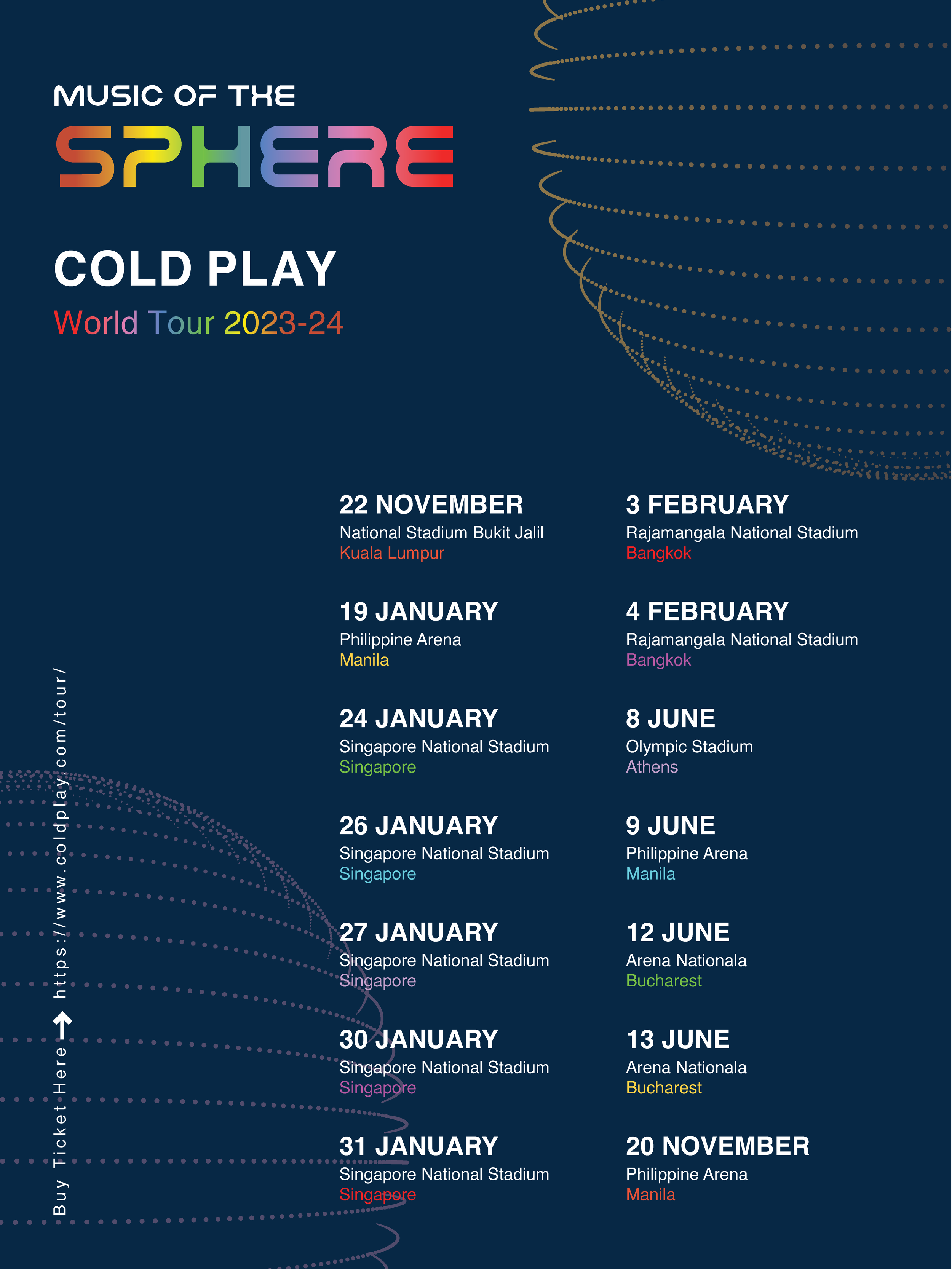
For this project, I decided to design a poster for Coldplay's "Music of the Spheres" world tour (2023-24). Coldplay's posters are usually bright and colorful with a galaxy theme, but I wanted to try something different—a cleaner, simpler look that still captured the feel of their music.
I used a modular grid system to help keep everything organized and balanced. Instead of using lots of colors, I chose a deep navy background that feels like the night sky but isn’t too obvious. I kept the text simple and clear to make sure all the important information, like the dates, venues, and cities, is easy to read.
Advertising
Poster Design
Concert Poster Design
Mockup


To keep a hint of the "Music of the Spheres" theme, I added a dotted arc that looks like a planet's orbit but doesn’t overpower the design. I used a colorful font for the word "SPHERE" to connect with Coldplay's usual style, but kept it limited to just that word to maintain a clean and modern look.
I organized the event details in a way that's easy to follow, with the dates and locations in a neat vertical format. I also included the website and ticket information at the bottom left side in a way that doesn’t distract from the main content. My goal was to create a poster that feels fresh and clear while still being true to Coldplay’s vibe.


