
THE SPINE CRACKERS- LOGO & VISUAL IDENTITY REFINEMENT
WSU Students Book Club
The Spine Crackers is a student book club at Wayne State University focused on creating a welcoming community around books and reading. As Social Media Chair, I develop visual content for the organization while helping establish a more consistent and recognizable visual presence across digital and print platforms. I also refined and vectorized the club’s existing logo, creating a cleaner, more versatile visual identity while preserving its original concept.
Challenge
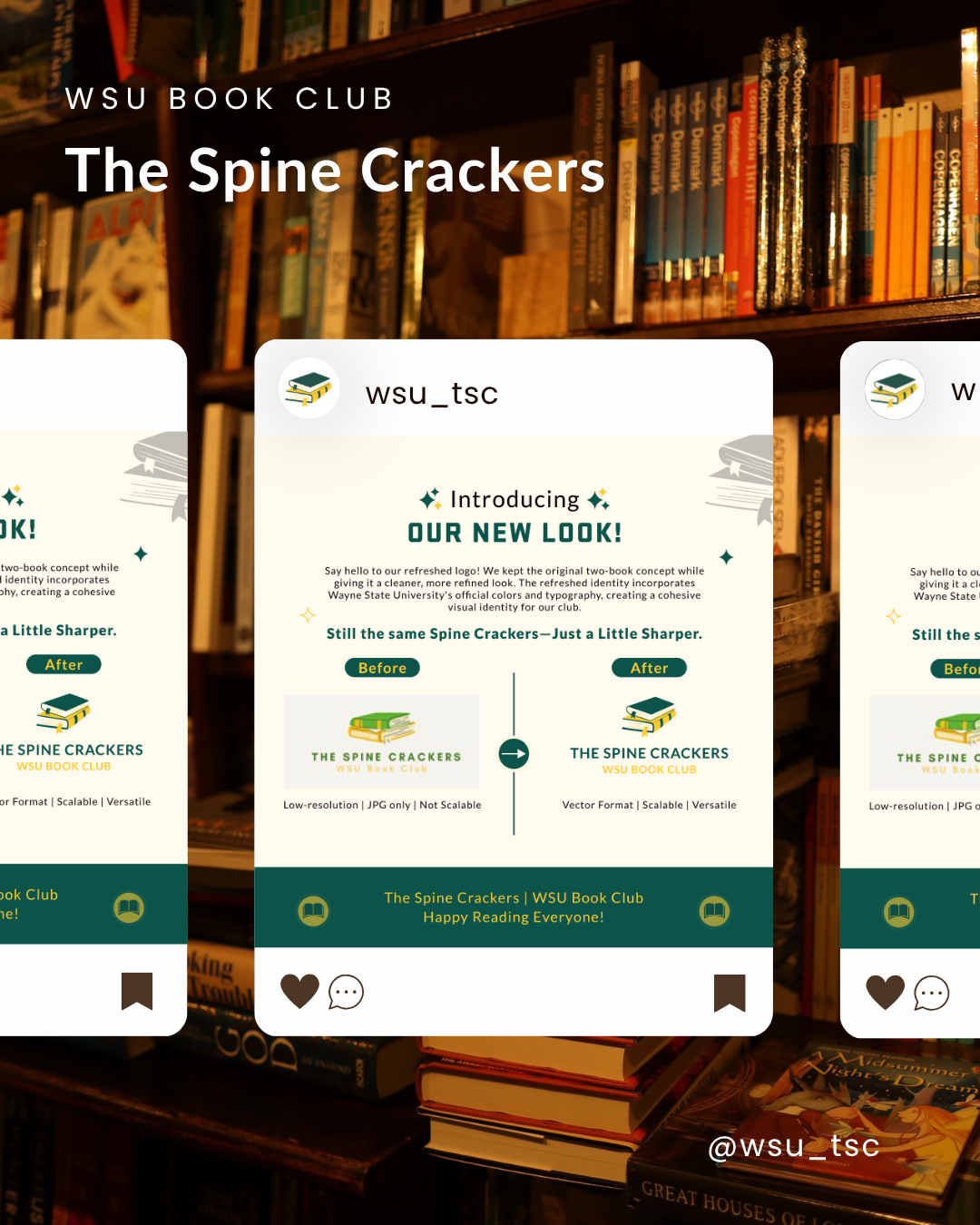
The original logo was only available as a low-resolution raster image, limiting its scalability and versatility across different applications. The visual presence also lacked a consistent system across social media and promotional materials. The goal was to preserve the recognizable two-book concept while creating a cleaner, scalable, and more cohesive identity.
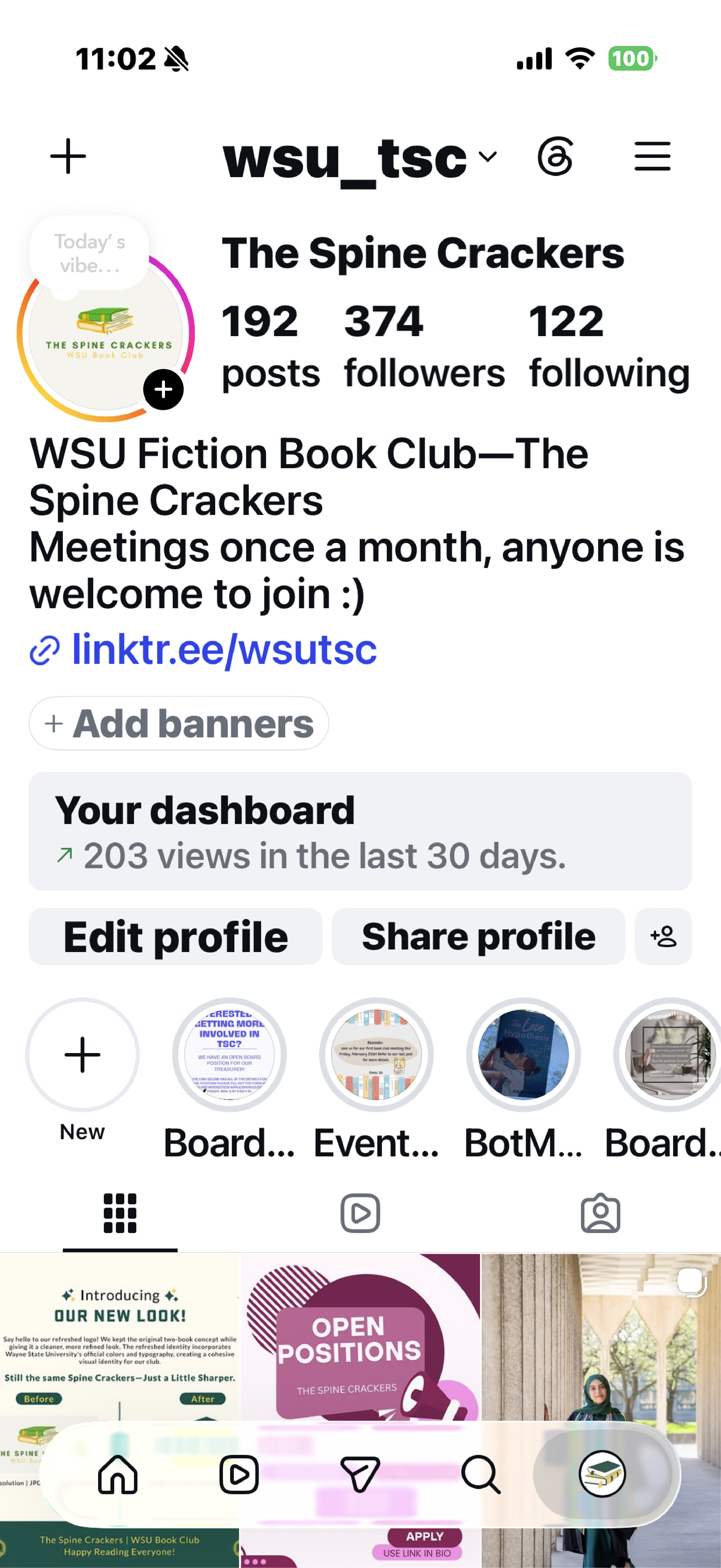
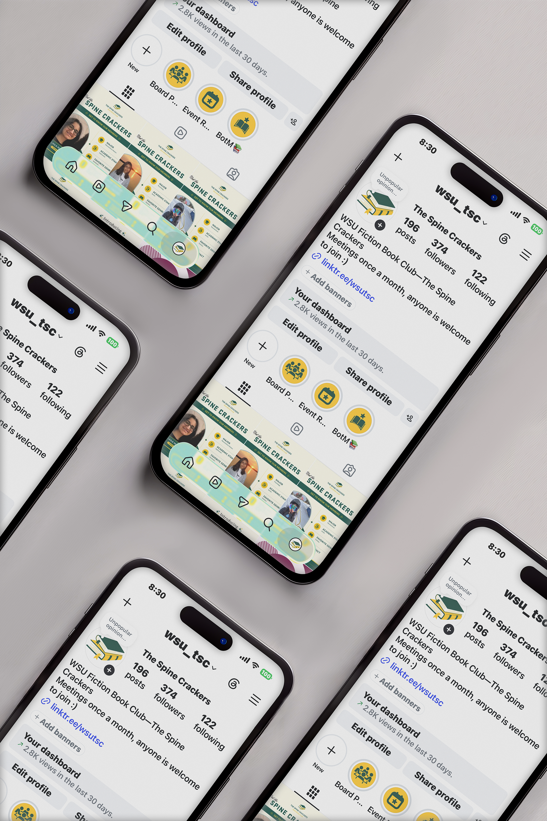
Existing Instagram Presence and orginal logo
The club’s social media before the rollout of the refined visual identity.

Building a More Flexible Identity
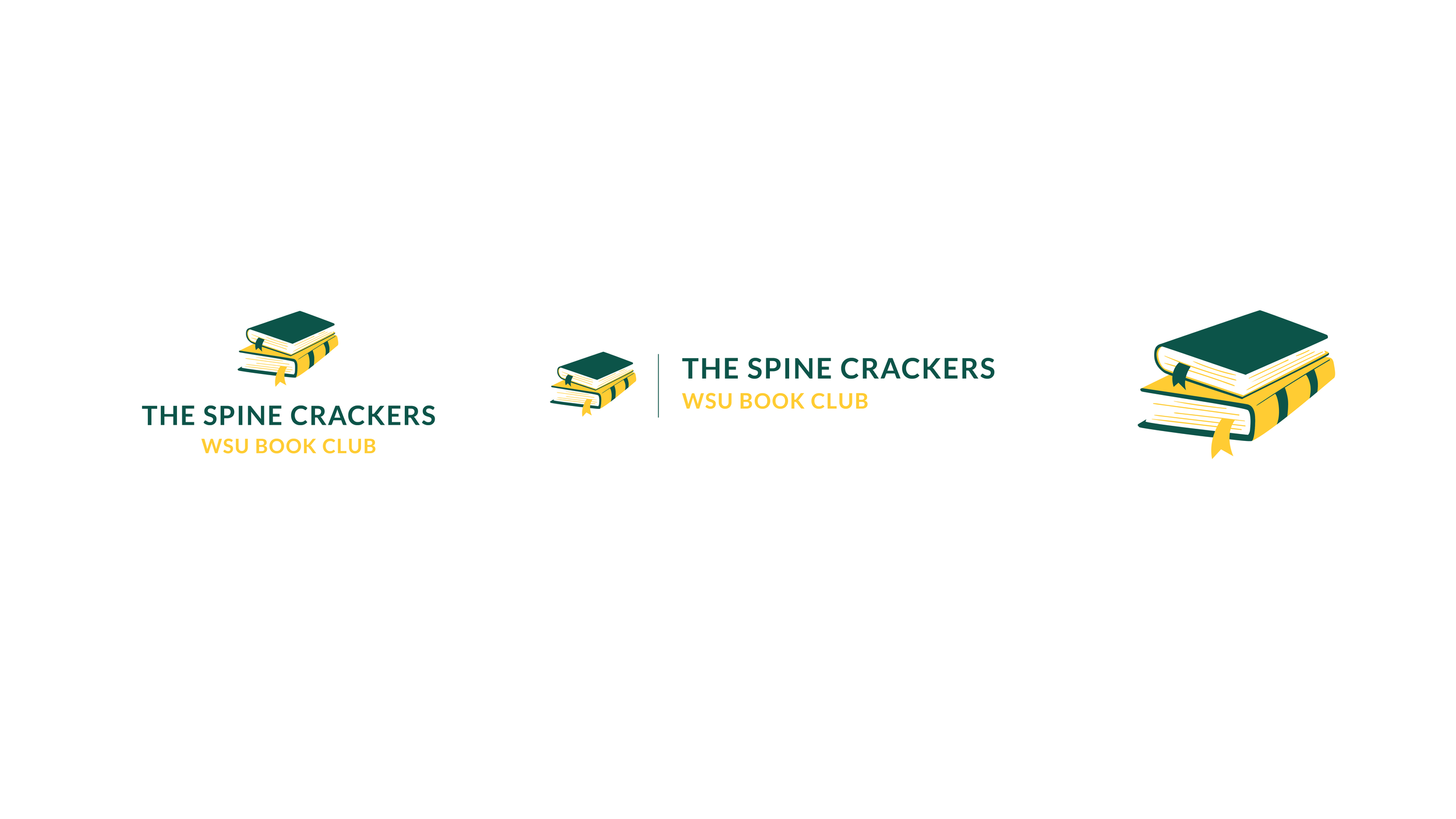
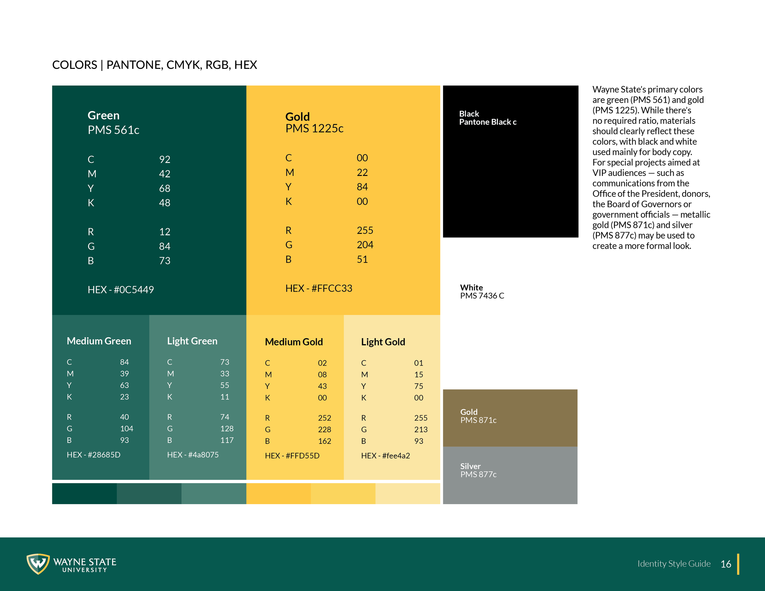
Rather than replacing the club’s existing identity, I refined and vectorized the original two-book concept while preserving its recognizable character. I developed additional logo formats using Wayne State’s color palette and typography, creating a more versatile identity for use across digital and print applications. The identity also includes green, gold, black, and white variations to maintain clarity and consistency across different backgrounds.
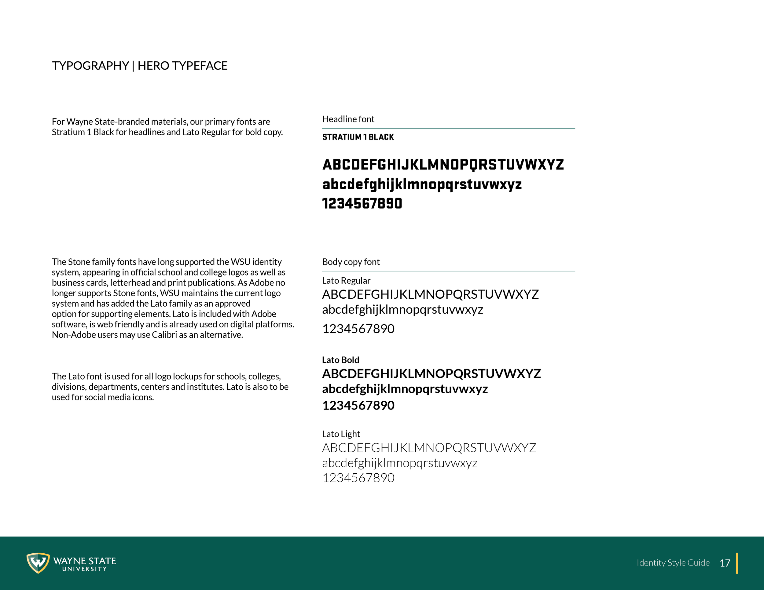
WAYNE STATE UNIVERSITY BRAND ELEMENTS
Creating a Consistent Social Presence
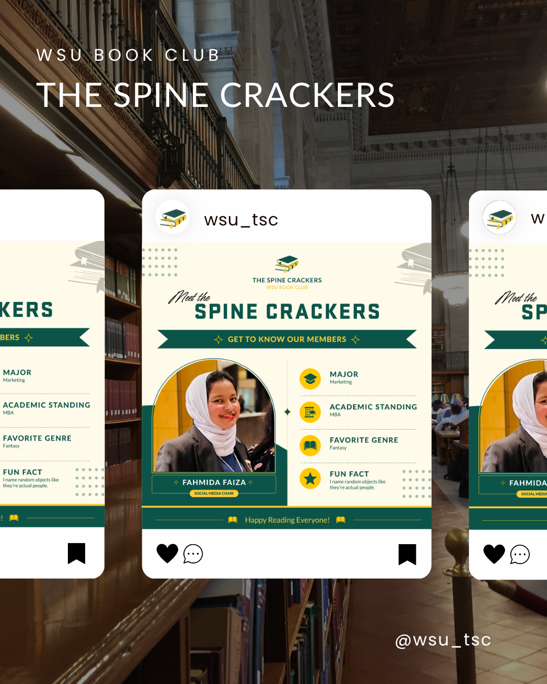
The refined identity became the foundation for a more cohesive social media presence. I developed reusable templates for recurring content, such as member introductions, while creating flexible designs for events, seasonal campaigns, and other club updates. Consistent use of color, typography, and graphic elements allows each post to feel distinct while still remaining recognizable as part of The Spine Crackers.
Extending the Brand
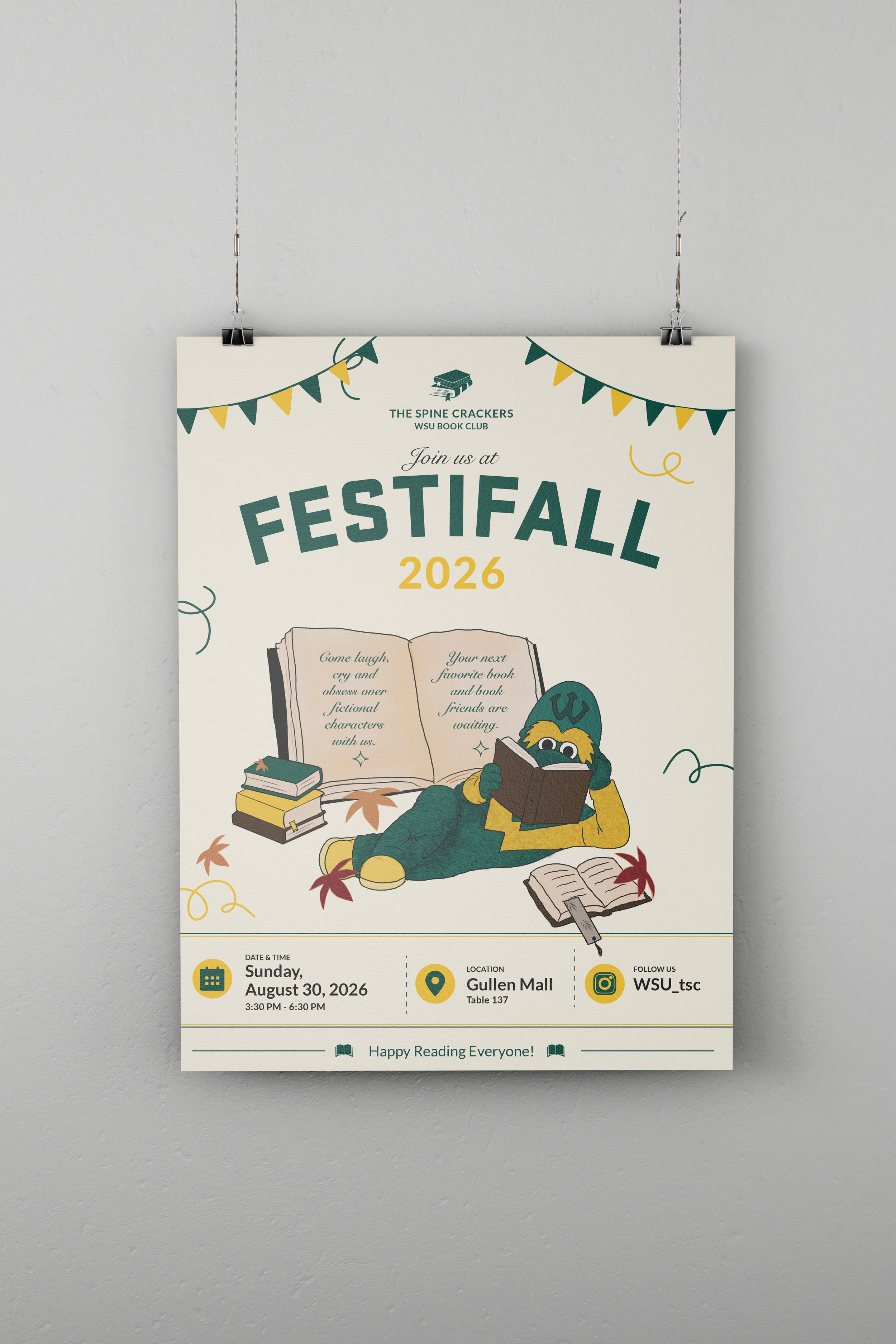
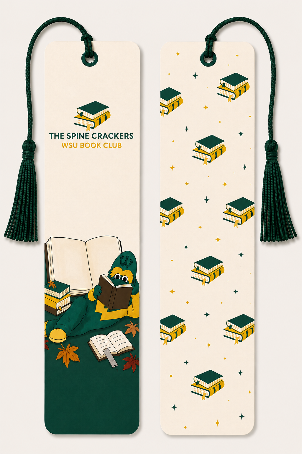
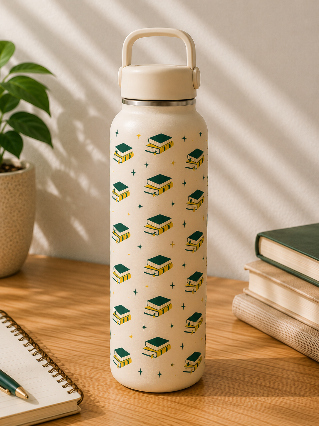
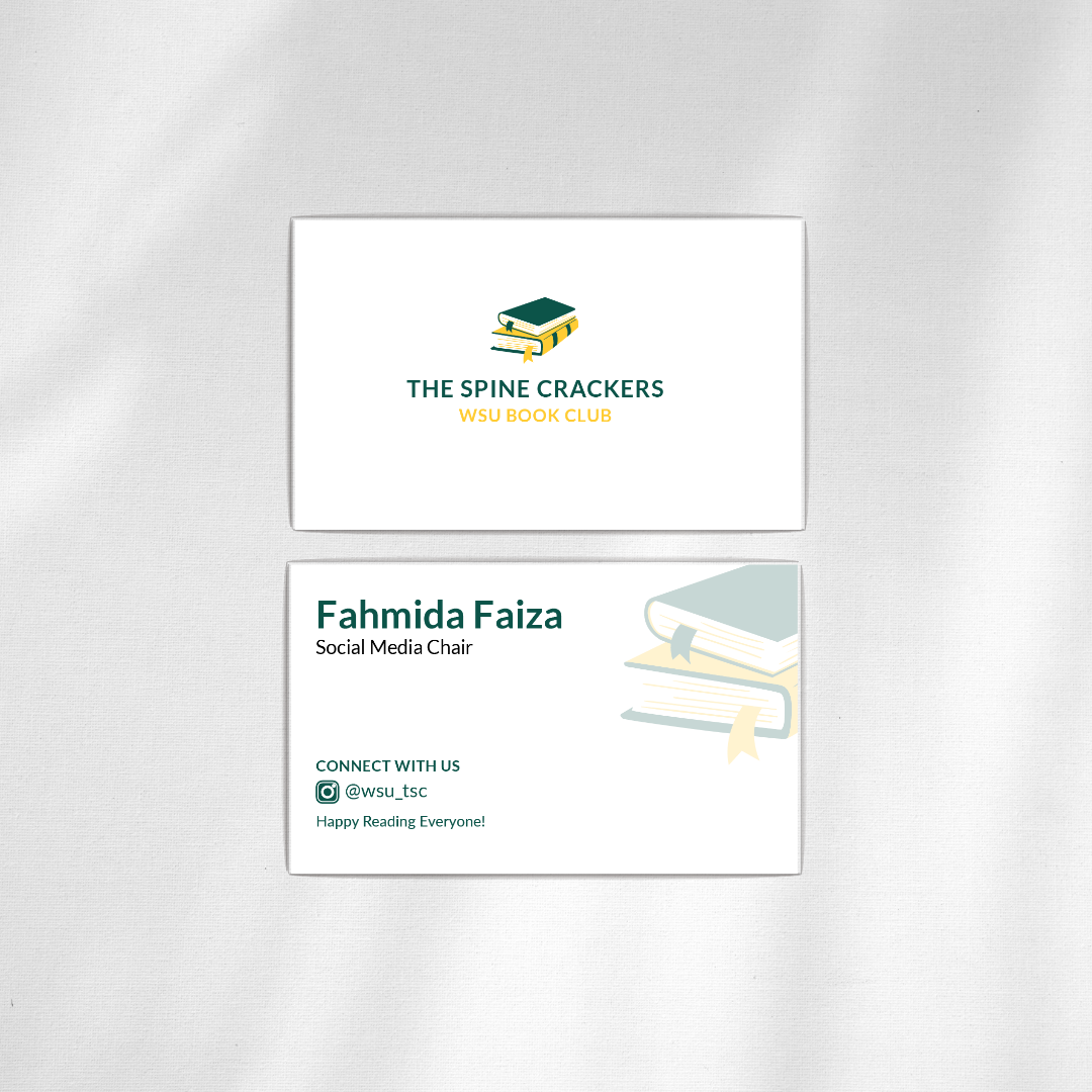
The visual identity was designed to extend beyond social media. I applied the system across event promotions, bookmarks, merchandise, and other student-facing materials, demonstrating how the brand could remain recognizable and cohesive across a variety of applications.


Outcome
The project evolved The Spine Crackers from a limited, low-resolution logo into a versatile and cohesive visual identity designed to grow with the organization. The new system provides greater flexibility across social media, campus events, print, and merchandise while preserving the familiar character of the original brand.
Through this project, I was able to bring together brand refinement, social media design, illustration, and visual communication to create an identity that feels both recognizable and adaptable for the club’s evolving needs.